Eli Dourado has a great post on whether we can believe we’re still in the short run (see Bryan’s critique here). Along the way, Dourado calls into question the sticky debt channel, correctly noting that according to official estimates, household debt payments are at quite low levels–and a big reason is because of today’s low interest rates.
However, the data he draws on for household debt payments don’t report how much households are actually paying: The data instead report “estimated required payments.” Glad to be corrected but that sounds like minimum payments on credit cards, required mortgage payments, etc.
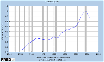
In fact, it looks like households are paying a lot more than required. Here’s the Flow of Funds ratio of total household and nonprofit liabilities over GDP. The Great Deleveraging is proceeding apace, and unless that’s all debt forgiveness and bankruptcy, debt payments appear to be higher than the monthly minimum:
But I don’t think monthly debt payments are the main way that balance sheets matter. After all, when people pay down debt that money goes to somebody else–a lender–who can decide how best to invest the repaid cash.
(Thanks for Bill McBride for creating the graph)

READER COMMENTS
Tom West
Sep 20 2012 at 10:33am
Very interesting post.
I’m curious as to whether it’s more important to the banks whether the total net worth be higher, or whether it’s the number of families with a net worth above a certain level.
My instinct says the latter, but if so, I think am even more informative graph (although the one posted is certainly eye-opening!) would the total net worth for each quintile, or something like that.
There’s a graph here (http://www.asymptosis.com/household-net-worth-by-quintile-62-09-be-prepared-to-scroll.html) but unfortunately it’s really about the 1%, so the scaling is not conducive to seeing how each quintile did…)
MG
Sep 20 2012 at 1:02pm
Interesting subject, to which I will add a few points to ponder:
Net worth should also include the NPV of after-tax future earnings (human capital). I have not seen the time series for this, but I suspect it must mirror (if not exceed in bearishness) that of traditional net worth.
Offsetting all this mark-down can be the extent to which there is unrecognized and valuable net worth tied up in regulatory reform, the unleashing of the North American energy miracle unfolding before our very eyes, and the next technological breakthrough.
RPLong
Sep 20 2012 at 1:09pm
I accept Prof. Jones’ argument, and feel that it implies a higher market rate of interest.
I do not think that the Fed should raise interest rates, but isn’t it problematic that Fed policy seems to be working in the opposite direction of presumed equilibrium? I thought the argument for market intervention was market failure. In this case it looks like the market is sending a clear signal that is nonetheless being intercepted by the Fed.
Are we really to believe that this mismatch can be corrected by attempts to trick the consumer into believing that s/he will have a higher future net worth? And if so, is an expected high future interest rate the way to do that?
Philo
Sep 20 2012 at 2:21pm
You write: “We are not as trustworthy as we thought we were.“ But what your graph shows is that we are not as trustworthy as we *actually* were. Our (actual) net worth is less than it actually was, not just less than what we thought it was.
kebko
Sep 20 2012 at 4:13pm
I think it should be pointed out that the net worth graph is as a percentage of GDP. The implications of that are different than if absolute net worth was at the same level as the late 90s.
Comments are closed.